Coursera: Degree application form

The Challenge
The degree application experience brought learners off platform, making it difficult to track data and provide said data to university partners without manually having to do so.
Rahul, my product design partner, and myself were tasked with coming up with a solution using Salesforce. Quickly, we found that bringing the form on-platform would be best for all stakeholders involved.
We were intent on making the form accessible, inclusive, and perhaps even fun to fill out. With our combined skills, we did just that and created waves to improve the UX and inclusivity.
SERVICES Stakeholder interviews, journey mapping, personas, competitive analysis, content audit, data analysis, product strategy, content strategy, content modeling, UX writing
PROJECT Redesign degree application form that could be customized per program
STRATEGY Define problems and solutions based on 2 previous releases and bring the form on platform to retain data for marketing purposes
RESULTS Content explorations brought leadership’s awareness to the need of a universal profile; accessibility and inclusion guidelines were developed and released to improve form copy
The solution

Stakeholder interviews
After mapping out the stakeholders based on function and confirming with the product manager, I conducted a total of 13 stakeholder interviews over the course of 2 quarters.
The information they provided helped the core team to define the problem and solutions for the form’s redesign. They also brought to light features that partners had been asking partner success managers for, which broadened our strategic thinking.

Journey mapping
From there, we combined our efforts and laid out journey maps for the current learner and partner experience. Collecting qualitative and quantitative data points, we further defined what was working and what needed improvements.
I focused on learner and partner feedback we’d received on the content itself, while my design partner took note of the UI/UX issues. Overall, we were able to collect specific issues that we could iterate upon.

Personas
The stakeholder interviews revealed 4 personas that we needed to consider in the redesign: learners, university partner marketers, university partner registrar, and Coursera’s degree marketing team.
It came down to the clarity of the problem statements for each that would lead us to our next steps, including improved info architecture, data collection, and disbursement.

Competitive analysis
From first-hand experiences—I applied to a master’s program and got in—to competitive and analogous experiences, my design partner and I collected screenshots of the latest forms.
We collected data about industry standards and best practices, and outlined the UX heuristics that stakeholders agreed were the most important to consider.
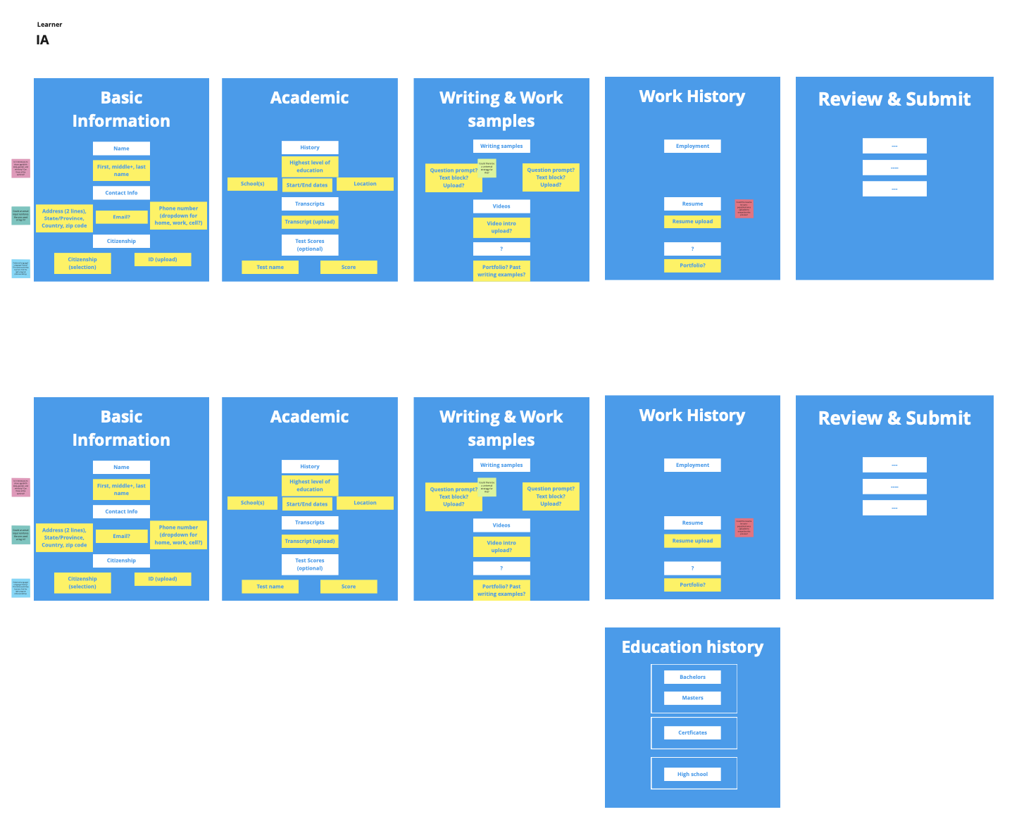
Information architecture
From all of the discovery work that we did, it was easy for me to lead with a content-first approach and define the information architecture of the degree application.
This was taking into consideration all of the feedback from stakeholder interviews, the current experience, data and past research, competitive analysis, and our UX heuristics.

Content audit
Next, I audited the experience based on the live applications of 5 university partners. This enabled me to get a bigger picture of the holistic content strategy. And to follow up with partner success managers for more details on unique info university’s required.
From there, I designed content models and tested the info arch and form copy on multiple applications to ensure its applicability.
Writing samples
To improve the UI text of the form, I applied our UX heuristics and content design best practices. This enabled partner success managers to show university partners how the redesign application form could potentially increase submissions through improved UX/UI.

Before

After
Degree application form
Here’s 1 example from the final application flow.
The content takes a conversational approach by asking emotionally intelligent questions to engage the user.
Form fields are in alignment with accessibility and inclusion guidelines, taking into consideration a wide international user base.
Progressive disclosure and a content model with primary, secondary, and tertiary information allows only the necessary info to be seen, creating a feeling of a shorter form.
Mobile designs take into account the high volume of users that apply by smartphone.

Introduction

Personal info

Writing samples

Work experience

Review and submit

Mobile